Advance Typography Task 2 Key Artwork
15 October 2024 - 11 November 2024
WANG ZILONG (0361141)
Advanced Typography | Bachelor of Design in Creative Media | Taylor's University
Task 2: Key Artwork
List
Lecture
Introduction
Progress
Submission
Feedback
Further Reading
Reflection
LECTURES
Week 5
AdTypo_5_Preception And Organisation
Perception & Organisation
Perception is “the way in which something isregarded, understood, or interpreted.”
Preception in typography deals with the visual navigation and interpretation of a reader via contarst, form and organisation of the content.
Contrast
There is several methods to create contrast (by Rudi Ruegg):
- Light/ Bold
- Condense/ Extended
- Organic/ Machined
- Roman/ Italic
- Small/ Large
- Negative/ Positive
- Serif/ Sans serif
- Ornate/ Simple
- Red/ Blue
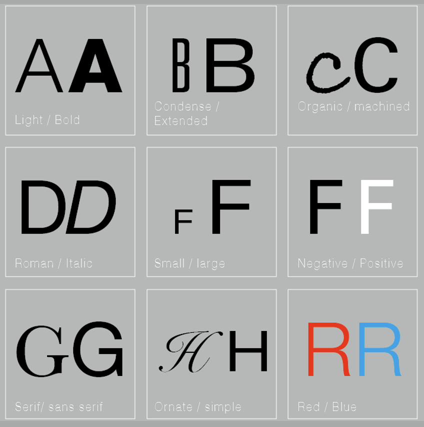
Fig 1.5.1 Type of Contrast (by Rudi Ruegg)
Besides, Carl Dair adds two more principle:
1) Size
Contrast in size provides a point for reader’s attention to be drawn. For instance, we will obviously see the big letter first before the small. Some commomn use of size is the make the title or heading bigger to be more noticible.
2) Weight
Weight is bold type can stand out in the middle of lighter type of the same style. Besides, rules, spots, squares are used as “heavy area” for a visual attraction or emphasis.
3) Contrast of Form
Contrast of form is the distinction between letters. Example of forms: Capital letter, lowercase letter, roman letter, italic, condensed and expanded.
4) Contarst of Structure
Structure means the different letterforms of different kinds of typefaces. Example of structure: monoline sans serif, traditional serif, italic and blackletter.
5) Contarst of Texture
Texture is the way the lines of type look as a whole up close and from a distance. This depends partly on the letterforms and the arrangement.
6) Contarst of Direction
Contrast of direction is the opposition between vertical, horizontal, and the angles in between. Mixing wide blocks of long lines with tall columns of short line can create contrast roo.
7) Contrast of Color
A second color is often less emphatic in values than plain black on white. Therefore it is important to give thought to which element needs to be emphasized and to pay attention to the tonal values of the colors that are used. Thus, it is important to evaluate which elements that need to be pay attention.

Fig 1.5.2 Type of Contrast (by Carl Dair)
Form
For refers to the overall look and feel of the elements that make up the typographic composition. It is the part that plays a role in visual impact and first impressions.
A good form in typography tends to be visually intriguing to the eye; it leads the eye from point to point, it entertains the mind and is most often memorable.
Typography can be seen in 2 function: Represent a concept and a visual form
When a typeface is perceived as a form, it no longer reads as a letter. Instead, it has been manipulated by distortion, texture, enlargement, and has been extruded into a space.

Examples of Form

Fig 1.5.3 Form with good communication
Organisation and Gesalt
Gestalt theory emphasizes that the whole of anything is greater than its parts as we experience things as unified whole. Although each element may be functional at an elemental level, the overall form is till greater than the sum of its part.

Fig 1.5.4 Gesalt Principles of Grouping
1) Law of Similarity
It states that humans tend to perceive elements that are close to each other as belonging together, spatial arrangement of visual elements influences our perspective of their relationship and grouping
2) Law of Proximity
It states that elements that are close together tend to be perceived as a unified group whereas items further apart are less likely to be grouped together.3) The Law of Closure
It refers to the mind’s tendency to see complete figures or forms even if a picture is incomplete, partially hidden by other objects, or if part of the information needed to make a complete picture in our minds is missing
4)Law of (Good) Continuation
It states that humans tend to perceive each of two or more objects as different, singular, and uninterrupted object even when they intersect. The alignment of the objects or forms plays a major role for this principle to take effect.
5) Law of symmetry
It explains how humans perceive visual elements as balanced when they are arranged in symmetrical or follow a predictable pattern.
INSTRUCTIONS
This is the Module Information Booklet for this module:
Task 2: Key Artwork
Before sketching, we will be asked to draw a mind map about ourselves. We need to find keywords that represent ourselves. Prepare for further design in the future.

fig 1.1 mindmap of me
Idea developmemt
First, I found some font design pictures on the Internet that gave me some inspiration. I listed up some of the main keywords of myself.

fig 2.1 Refer from the style of the font

fig 2.2 Getting the inspiration from the font
1. Overall design language
Style positioning: The font should have both modern and historical characteristics, with both intuitive power and deep expression of emotions and spiritual levels.
Main features:
Solid geometric shape (representing courage and tenacity).
Soft detail processing (reflecting the tolerance of faith and the growth of resilience).
Moderate dynamics and contrast, reflecting the balance between multiple qualities.
2. Letter structure
Basic form
Line thickness: Use medium-thick fonts to convey strength and tenacity through thick lines, while avoiding being too heavy to maintain flexibility.
Stroke endpoints:
Some letters use sharp corners (such as A, V, W) to express courage and decisiveness.
The other part has soft rounded corners (such as O, C, S), symbolizing the tolerance of faith and the restoration of resilience.
Proportion
Height and width ratio: Slightly increase the height of the letter (such as lengthening the vertical line part) to give people a sense of uprightness and indomitable spirit.
Horizontal and vertical contrast: The horizontal line is thinner and the vertical line is thicker (such as letters T, H, E), conveying the power of tenacity and support.
Special details
Cross or crack design: Some strokes of the letters have a slight "crack" effect, but will not destroy the overall structure (such as K, X), suggesting resilience.
Support lines: Embed implicit "support structure" elements in some letters to symbolize tenacity and the cornerstone of faith (such as adding internal structure to M).
3. Style unification
Combination of curves and straight lines
The courage and tenacity parts are constructed with straight lines and sharp angles.
The faith and resilience parts are transitioned with curves and circles.
The combination of the two can form a unique tension through the contrast between smooth curves and sharp edges.
Texture
The font can have a visual "metal scratch" effect: the letters seem to be hammered, with a slightly concave and convex texture on the surface, conveying the beauty of frustration and tenacity.
Dynamic sense
Slightly add tilt or arc to the overall design of the letters to convey the image of moving forward and growing (for example, the overall font is slightly tilted to the right by 5 degrees).
4. Color suggestions
The font can be designed in multiple color versions:
Basic black and white: emphasizes functionality and contrast, used in simple scenes.
Metallic colors: such as dark gold and silver gray, emphasize the persistence of faith and tenacity.
Gradient colors: The gradient from dark red (courage) to dark blue (faith) expresses the fusion of multiple qualities.
5. Application scenarios and font names
Name: It can be named "Fortis Faith" (Latin for "tough faith") or "Unbreakable Spirit".
Application: Suitable for brand design, monument inscriptions, game or film and television titles, etc., to express strong spiritual power and profound meaning.
Sketches
Designing key artwork is a journey of creativity. This project focuses on merging fractured typography with dragon-inspired motifs, reflecting strength, resilience, and mythical vitality.
Concept and Ideation
The goal was to blend gritty, fractured text with dragon imagery. Key considerations included:
Conveying strength and endurance through textures.
Abstracting dragon motifs to complement the typography.
Balancing legibility and artistic expression.
Typography Exploration
For the typography, I sketched:
Geometric Fractures: Sharp, angular breaks resembling shattered glass.
Organic Cracks: Natural textures like dried earth for a softer look.
Erosion Effects: Faded edges evoking timeless wear.
Integrating the Dragon
Incorporating the dragon involved:
Abstract Silhouettes: Weaving the dragon’s body through the text.
Textural Overlays: Adding dragon scales to the typography.
Symbolic Details: Subtle motifs like claws or flames to enhance the design.
The sketches lay the groundwork for the final digital artwork, where textures, colors, and details will bring the concept to life. This fusion of fractured typography and dragon elements aims to create a bold, meaningful design.

fig 3 the sketch & keywords of my design
Colour Palette
Thematic Color Palette
To align with the theme, the color palette focuses on black, red, and gray. These colors embody the essence of the design:
Black: Represents strength, power, and the fractured typography’s rawness.
Red: Adds vitality, energy, and a mythical intensity reminiscent of dragon lore.
Gray: Balances the palette with a neutral tone, evoking a sense of resilience and timelessness.
This combination reinforces the artwork’s themes of strength and mythical allure, ensuring the visuals are impactful and cohesive.

fig 4 the selected colour palette
Key Artwork Animation
Creating the animation for the key artwork involved translating static designs into a dynamic narrative, blending technical skill, creativity, and storytelling. The fractured typography was animated to symbolize resilience and unity, while the dragon motif added a sense of vitality and motion. Gradual transitions of the black, red, and gray palette amplified the thematic energy, creating a cohesive visual impact. Sound design further enhanced the experience with metallic effects, dragon roars, and rhythmic transitions, tying the visual elements seamlessly to auditory cues.
This process underscored the importance of iteration, balancing dramatic effects with subtle details to maintain coherence. The final animation enriched the design’s narrative depth, transforming it into an interactive experience and opening doors to explore new multimedia and interactive platforms.
Expansion

fig 6 the expansion of artwork
Theme and inspiration
The dragon symbolizes power, dignity and infinite vitality in Eastern culture and my name includes the word 'long' which in chinese means dragon, so the font should have the following characteristics:
Dragon's shape: The power and agility of the dragon are conveyed through the font structure, such as the dragon's circling and leaping posture.
Combination of tradition and modernity: It is necessary to reflect the traditional cultural connotation and integrate modern design sense to adapt to various scenarios.
Design language
1. Lines and structure
Stroke extension: Some font strokes can be designed to have a decorative effect similar to dragon scales or dragon whiskers to enhance the sense of mystery and agility.
Arc combination: Introduce smooth arcs inside the font, as if the dragon's body is coiled, such as the "sun" or "moon" characters can have a shape similar to dragon eyes or dragon balls.
Alternation between sharp angles and softness: The end or intersection of the font can use a sharp "claw" shape, while matching the soft "scales" transition to show the hardness and softness of the dragon.
2. Three-dimensional and layered
Increase the "leaping feeling" of the font, and make the font look as if it is floating in the air, like a flying dragon in the sky, through gradient or shadow design.
Add dragon scale texture at the turning point of the letter, layer by layer, to create a detailed visual effect.
3. Dynamic elements
Font design can combine the waving feeling of the "dragon tail", lengthen some strokes or bring out a flowing trajectory to simulate the posture of a flying dragon.
The image of "cloud" or "water" can be added to the bottom or end of the font, such as the harmonious state of the dragon and nature.
Cultural and symbolic design
Specialization of the word dragon:
In the font with "dragon" as the core, the word dragon can be used as the visual center to highlight its symbolic meaning.
The strokes of the word dragon are designed in the shape of a circling dragon body, and the font as a whole forms a complete "soaring dragon" pattern.
Integration of other characters: The remaining fonts echo the word "dragon", such as adding continuous arcs or details similar to dragon whiskers between the fonts to make the overall harmony and unity.
Final Task 2A: Key Artwork

fig 7.1 the black wordmark with white background

fig 7.2 the white wordmark with black background

fig 7.3 the colour palette

fig 7.3 the scarlet wordmark with black background

fig 7.4 the scarlet wordmark with grey background
Task 2B Collateral
My main ideas for the brand identity will be something related to the fashion design.
These are my ideas for the mockup:
-T-shirt
-Sunglasses
-Cold hat

fig 8.1 T-shirt mockup

fig 8.2 Sunglasses mockup

fig 8.3 Cold-hat mockup

fig 8.4 T-shirt mockup
Concept and Ideation
The goal was to blend gritty, fractured text with dragon imagery. Key considerations included:
Conveying strength and endurance through textures.
Abstracting dragon motifs to complement the typography.
Balancing legibility and artistic expression.
Typography Exploration
For the typography, I sketched:
Geometric Fractures: Sharp, angular breaks resembling shattered glass.
Organic Cracks: Natural textures like dried earth for a softer look.
Erosion Effects: Faded edges evoking timeless wear.
Integrating the Dragon
Incorporating the dragon involved:
Abstract Silhouettes: Weaving the dragon’s body through the text.
Textural Overlays: Adding dragon scales to the typography.
Symbolic Details: Subtle motifs like claws or flames to enhance the design.
Expansion into Lifestyle Items
Building on the key artwork, the design can be extended to various lifestyle products, ensuring visual coherence and appeal:
Sunglasses: Incorporate fractured textures on the frames with subtle dragon-scale patterns on the temples for a bold and stylish look.
T-Shirts: Feature the artwork as a centerpiece, with dynamic placement of fractured typography and dragon motifs. Experiment with black, red, and gray colorways for versatility.
Beanies (Cold Hats): Use minimalist versions of the artwork, such as a scaled-down dragon emblem or fractured text embossed or embroidered on the front.
Other Items: Consider tote bags, phone cases, and sneakers, integrating the design elements subtly or boldly to suit the product’s form and function.
Thematic Color Palette
To align with the theme, the color palette focuses on black, red, and gray. These colors embody the essence of the design:
Black: Represents strength, power, and the fractured typography’s rawness.
Red: Adds vitality, energy, and a mythical intensity reminiscent of dragon lore.
Gray: Balances the palette with a neutral tone, evoking a sense of resilience and timelessness.
Integrating Artwork into a Personal Portrait
To further personalize the project, the design elements can be integrated into a portrait. This involves:
Fractured Typography Overlay: Incorporating the typography into the background or as a subtle overlay on parts of the portrait, blending the personal and the artistic.
Dragon Motif Embellishments: Adding dragon-inspired elements, such as scales or flames, to the clothing, hair, or other features of the portrait.
Dynamic Color Accents: Using black, red, and gray selectively in the portrait’s highlights or shadows to tie it cohesively with the key artwork.
Symbolic Composition: Positioning the dragon imagery and fractured text to create a balanced yet striking composition that reflects individuality and thematic strength.

fig 8.4 Protrait mockup

fig 8.5 The final complication

fig 8.6 Whole mockup
Feedback
Week 5
After completing the first version of the work, I shared the design with my mentor and classmates, paying special attention to its potential in fashion applications. For example, the readability and visual impact of the letter design on T-shirts became the main discussion points. Some feedback suggested strengthening the recognition of the letter shape and optimizing the integration with the background pattern. Based on these opinions, I adjusted the proportion of the font so that the letter design can be clearly displayed on the front and cuffs of the T-shirt. At the same time, for the combination of letters and fashion elements, I introduced fabric texture effects, such as adding soft gradients and delicate texture treatments to the "coffee cup" element to make it more suitable for application on fabrics. By continuously optimizing details, the works at this stage began to gradually have the potential for commercialization and fashion.
Week 6
This week's focus is on extending font design to the fashion field, especially T-shirt design. First, I made several different styles of T-shirts, including simple, street style, and art derivative styles. In the simple version, I presented the letter design in monochrome to highlight the cleanliness and power of the form; in the street style design, I added graffiti-style details and dynamic elements to make the design more dynamic; in the art derivative version, I tried to use gradients and geometric compositions to integrate the letter design into the overall pattern to show a stronger visual impact. In addition, I also considered the impact of different fabrics and colors on the design, tested the adaptability of letters and flexible materials, and ensured that the design can maintain high-quality performance in various fashion applications.
Week 7
In the last week, I made the design results into a complete fashion series display, including T-shirt posters, product samples and brand logos. In order to emphasize the unity of the work, I created corresponding scene backgrounds for each design, such as the street-style graffiti wall, the minimalist interior style of the simple version, and the modern gallery atmosphere of the art derivative version. These backgrounds not only enhance the expressiveness of the work, but also highlight the fashion attributes of the design. After completing the T-shirt display, I further reflected on the whole process: the combination of font design and fashion makes the work more practical and opens up more possibilities. This experiment made me realize that fonts are not only a visual language, but also an extension of personal brand and style.
Reflection
This project has been a rewarding exploration of artistic fusion and creative problem-solving. By integrating fractured typography with dragon elements, I was able to express themes of strength and resilience while maintaining a balance between abstraction and clarity. Expanding the artwork into lifestyle products and personal portraits allowed the design to transcend its initial scope, showcasing its versatility and adaptability.
Key takeaways from this journey include:
The Power of Iteration: Each step refined the concept, demonstrating that creative breakthroughs often emerge through persistence.
The Importance of Balance: Harmonizing complexity with simplicity ensured the design remained impactful without overwhelming the viewer.
Symbolism as a Core Element: Personalizing the artwork with meaningful symbols enriched its narrative and emotional resonance.
Looking ahead, this project inspires further experimentation with combining artistic and functional designs. It serves as a reminder that creativity thrives when ideas are allowed to evolve and adapt to new contexts.
Further Reading

fig 9 Typographic design: Form and communication (2015)
Throughout this project, the principles outlined in Typographic Design: Form and Communication (2015) by Rob Carter, Ben Day, and Philip Meggs provided invaluable guidance. This seminal work explores typography as both an art form and a means of communication, offering insights that resonated deeply with my design process.
Key concepts from the book that influenced this project include:
Typography as a Visual Language: The book emphasizes how type conveys meaning beyond words. This idea inspired the fractured typography in my design to reflect themes of strength and resilience, using form and texture as communicative tools.
Hierarchy and Balance: Carter et al. stress the importance of establishing visual hierarchy while maintaining balance. This principle guided the integration of dragon motifs and typography, ensuring that neither element overshadowed the other.
Symbolism in Design: The text discusses how symbols enhance narrative depth. Incorporating dragon elements as a symbol of endurance and mythical vitality aligned with this concept, enriching the artwork’s narrative.
Exploration of Contrast: The book’s analysis of contrast in typography helped refine the bold black, red, and gray color palette. These contrasting tones heightened the design’s impact and reinforced its thematic cohesion.
Typographic Design: Form and Communication serves as a cornerstone for understanding the interplay between form, function, and expression in typography. Its insights provided a strong theoretical foundation for translating abstract ideas into visual reality in this project. For anyone interested in pushing the boundaries of typographic design, this book is an essential resource.


Comments
Post a Comment